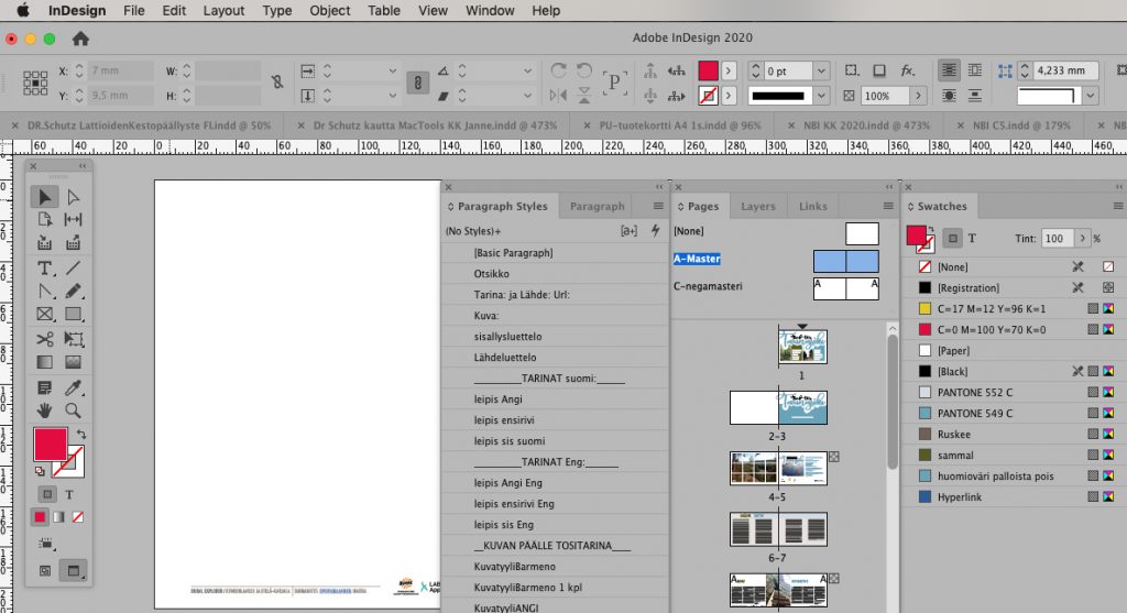
Here is some benefits on InDesign, when you create a great master-layout for pagemaking purposes on repetitive publish magazines.
Start
At the first we assembly settings for the hole magazine, meaning the size and the gutters, other possible lines to help layouting, like baseline grid, page numbers and other repeating logos or vinjets.
This basic setting can be copyed for abnormal spreads, example cover-page, -there is no pagenumbers, and layout can be very different from the other content. Or simplified, there are different numbers of columns on spreads, or color difference part of the magazines. Advertisement page are typical to be different also.
With welldone frame, we can concentrate to next level, fonts. We do styles for all the repeating elements like headings, lifts, body texts, indent body texts, first line indents, listings, drop caps etc. All of these, we will include exact font-info, size, line spacing, color, justification and hyphenation.
Paragraph Styles
You may want to start with the basic body text, make it to paragraph and copy that style-info to the next paragraph style, where you only have to do the abnormalitys. So when we decide to make changes on the basic style, it will be automatically repeat changes to all of these copy styles.
Most important heading – I think – is gap-heading. It’s build to be on baseline grid, but with the possibility to be abnormal, as a result from number of lines. Because gap-heading can be anywhere between 1 or 4 lines, or even more, then it is a better to be widen up for more columns. Set up a hyphenation for this but, allways cleanup all stupid hyphens from headings before proof.
With big headings you can have some fun. You can make a basic paragraph style for it, but after layouting other matherials, you can use all free space for it. So feel free to use manual settings for the headings.
Character styles
Character styles you can make as you need it. Example certain rules say what is bold, what is italic. Character styles is handy also to bring forth up some urls or other links, to be abnormal from basic body text.
Then we have also object-styles, you can define frame layout, line style, table style etc. It sounds painful at first, but it makes your life much easier later. Especially when you make same magazine many times at the one year, and years to go.
Colors
With these styles above you probably did meet colors all ready. You can build your swatches on the time you need it, or do readymade list with all the custom colors. Usually colors will be fold from pantone-colors, turning to cmyk. But there can be a need for pantone-colors also, if example logo needs to be a perfect, then remember, the panton only works with offset-printing, not in digital, because there colors will all ways be on cmyk.
Rgb- or html-colors does not work with prints, so when you want to do clean design, remember this on nativ-state of creating materials. Cmyk-colorspace is way narrow than rgb, there can and will be a major difference on screen to print, don’t be surprised for that.
Benefits
When basic-styles are on the orders, we can start working with the contents. All the work what we have done before, will pay you now. You can take new text, paste it right on to layout, only pick up styles, first make all to basic paragraph-style (to remove all differences from the original software), after that, just pick up abnormitys and Voela! – your texts are in order. Exceptionally hyphenations, in finish language, there are a lot of compound words, there’s a need to check those to compound-words, it will make reading much easier.
Little bit easier is to play with the photos and graphics. You can easily move or scale those in layout, just remember, only vector-graphic is scalable, with photos you will see pixels soon. But not with us, because we use only a right size measurement photos on layout – jeah. Benefits of good preparations. All photo frames can be identical with just one pick up from object-styles. Also abnormality it is easy to make from control panel.
Enjoy
Rest it is simple pleasure with enjoying lovely content. After you’re done all the styling and the settings, take a moment to think,- what is the major subject at the article, can you do more to bring it up – and how? Most important, is stay readable. Make sure all texts are layoutin nicely, clean, and do some effects with pictures and feelings, all that you think is possible to impress with. For the reader. For the reader. For the reader.
If you need some help with InDesign, just ask, I’m here to help you, if necessary – on your workstation.
More about InDesignSecrets
Back to articles

